

Today, businesses regardless of their size or industry vertical are generating a whopping amount of data. In fact, the amount of data that is produced every single day is truly mind-blowing. Many studies indicate that the current estimate for the amount of data produced stands at 328.77 million terabytes of data per day. By 2025, it is predicted that global data creation will surpass 181 zettabytes with the steady rise of smartphones, computers, wearable electronics, internet-enabled machines (IoT devices), and a host of gadgets with sensors. Despite the exponential growth of data, only a handful of enterprises are able to spot insights and patterns hidden in datasets. On the other hand, a large number of enterprises are still struggling to visualize data and chalk out a plan for data democratization. This is where the need for a BI and Data Analytics tool comes in.

When it comes to BI and Data Analytics, there is a wide repertoire of tools available in the market that support data-driven decision-making. Amidst all, Microsoft Power BI has been stealing thunder since it comes with a host of features that not only allow users to transform raw and unstructured data into meaningful insights but also enable them to create visually-rich data reports for quick decision-making. This self-service analytics tool has been around for over a decade and today it has become the most coveted choice for creating interactive dashboards for data visualization and analysis. What’s more interesting about Power BI is that Microsoft has positioned itself as a leader in Gartner’s Magic Quadrant for Analytics and Business Intelligence Platforms for 12 consecutive years
Foolproof Ways to Revolutionize Data Visualization With Power BI
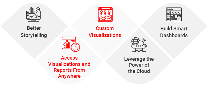
1. Better Storytelling
Typical pie charts work great for numbers, but when it comes to telling stories pertaining to data that changes with time, why not try out the expressive ‘Timeline Storyteller’? It is a visual storytelling environment that allows users to produce a linear list of dates or times or present disparate aspects of data in the form of grids, spirals, circles, timelines, or custom shapes. Besides this, users can present information that shows events’ duration, and a chronological list using a palette of layouts, scales, timeline representations, etc.
2. Custom Visualizations
Power BI comes with an array of rich visualizations beyond typical bar graphs or Gantt charts that include dial gauges, KPI scorecards, and Sankey charts to fuel dashboards and data reports. In other words, Power BI offers a host of customization and integration options for better data visualization. Users can download the applications to customize visual data from the Microsoft AppSource or they can also create their own using the Power BI Visuals SDK, which is based on R-language scripts and popular JavaScript libraries such as jQuery, D3, etc. Be creative with the rich library of open-source and customizable data visualization tools to visualize data in a better way.
How to Democratize Data With Power BI for Informed Decision-making
3. Build Smart Dashboards
Managers or decision-makers prefer concise reporting that tells a cohesive story pertaining to business, while analysts always look for more details without any clutter. Power BI caters to the needs of both users and brings the best of both worlds. With Power BI visualizations, dashboards can be fully customized to support the needs of data visualization of all users across the organization.
4. Access Visualizations and Reports From Anywhere
Stay on top of mission-critical data and share meaningful insights on the move with the Power BI mobile application. The best thing about MS Power BI mobile app is that it is compatible with both iOS and Android operating systems and allows users to access, edit, modify, or share dashboards and reports from anywhere. In a nutshell, Power BI offers a touch-optimized experience that facilitates users to stay connected with important business data from anywhere with ease.
How to Address Reporting Challenges
5. Leverage the Power of the Cloud
Enterprises looking for ways to improve operational efficiency, drive productivity, reduce costs, and foster team collaboration can benefit from a Cloud-based BI and Analytics tool. With Power BI running on the Azure Cloud platform, users can connect and collate data from multiple sources, which can further be analyzed to improve collaboration, communication, and decision-making.
Summing Up
Business Intelligence and Analytics applications like Power BI are empowering businesses of all sizes by establishing a data-driven culture that enables everyone in the organization to make sound decisions. If you are also planning to embrace this self-service tool in your business, you should seek end-to-end Power BI consulting from our seasoned BI professionals. By seeking consultation from our experts, you can make the most of Power BI data visualization software.
Case in Focus
A leading multi-door retail organization wanted to harness the potential of massive volumes of data generated across various touchpoints. The client had been using spreadsheets for the same. However, this was not only time-intensive but also necessitated a large amount of manual work. To offload manual drudgery, the client partnered with Damco Solutions. Based on the in-depth assessment of the client’s requirements, Damco’s data specialists recognized the need for Power BI implementation to load, clean, prepare, and visualize data. With Power BI implementation, the client optimized the inventory costs by around 30%. Read the detailed case study to explore how a robust analytics solution provided insights into sales, profit margins, customer buying behavior, and inventory management.