

Key Takeaways
- Dashboards should be built backward, starting from a specific business decision.
- Decision cadence, not department, determines the correct dashboard type and design.
- Operational, analytical, and strategic dashboards serve different decision-making timeframes and audiences.
- Every interactive feature carries maintenance costs and should earn its inclusion.
- Web Content Accessibility Guidelines (WCAG) 2.2 accessibility standards are now essential for dashboards.
- Dashboards need regular audits and retirement once they stop adding value.
Why do so many data visualization dashboards get built but never used?
Organizations follow every best practice available. They hire skilled analysts, invest in premium business intelligence (BI) platforms, and apply thoughtful design principles. The dashboards look polished. They launch on schedule. And then, quietly, they stop getting opened.
It is easy to see why this keeps happening.
Most dashboard projects start with the wrong question. Teams ask what data they have, what metrics matter broadly, or what the platform supports. The one question that determines whether a dashboard earns daily use never gets asked: what specific decision does this serve, and on what cadence?
A dashboard is a decision surface. Its type, content, layout, and refresh rate should all derive from that single question. When they do not, the result is a screen that displays information nobody acts on. The problem is not a shortage of design principles, but a lack of structure.
This piece builds dashboards for data visualization around that question. It covers taxonomy, the three dashboard types by decision cadence, design methodology, and chart selection, while talking about accessibility and lifecycle management.

Dashboard, Report, or Visualization: Understanding the Difference
The terminology around data visualization, dashboards, and reports gets used interchangeably. But these artifacts serve different purposes. Commissioning a dashboard when the actual need is a report produces a crowded screen nobody reads.
What Is a Data Visualization?
A data visualization answers one specific question through a visual representation of data. How is revenue trending? A line chart shows the answer. Which product category generates the most margin? A bar chart delivers it. A visualization exists to communicate a single insight, whether that insight appears in a presentation, a report, or as one component within a larger dashboard. These visualizations can be interactive. But their scope remains centered on answering the questions they were built to address.
What Is a Business Intelligence Dashboard?
A business intelligence dashboard curates multiple visualizations into a single decision surface designed for a defined audience and cadence. The dashboard pulls data from various sources and displays key metrics. This allows users to monitor performance, track progress toward goals, and make informed decisions fast.
Connected to live data, these business intelligence dashboards update on their own, which makes them suitable for daily or hourly monitoring. They show movement, but explaining why that movement occurred usually requires a different artifact.
What Is a Report?
A report provides a structured analysis of performance over a defined period. Reports freeze data at a point in time, so everyone reviews the same numbers. They combine tables and charts with written context to guide someone through what happened and why it matters.
Reports answer questions like: Which channels delivered the strongest ROI? Why did churn increase? The trade-off is flexibility. Once generated, follow-up questions often require creating a new version.
What Is a Data App?
A data app embeds analytics inside a workflow. While dashboards show information for consumption, data apps let users both view data and take action, with each action written back to the data warehouse under governance. Data apps allow users to run forecasts, kick off experiments, or approve workflows from the interface.
Quick Comparison: Which One Do You Need?
| Artifact | Main Goal | Typical Audience | Cadence | Lifespan |
|---|---|---|---|---|
| Data visualization | Answer a specific question | Analyst/user | As needed | Varies |
| Business intelligence dashboard | Support decision-making | Defined business audience | Defined cadence | Ongoing |
| Report | Explain a point in time | Stakeholders | Periodic | Fixed/recurring |
| Data app | Support an action or workflow | Operational users | Workflow-driven | Ongoing |
This guide focuses on the second row. Everything that follows assumes you have already confirmed that a dashboard, not a report or a single visualization, is what the decision requires.
The Three Types of Dashboards Based on Decision Cadence
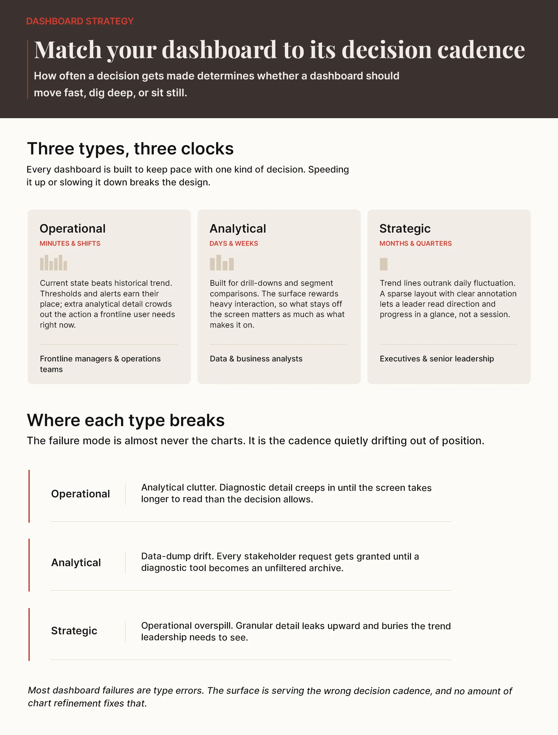
Most organizations categorize dashboards by department, which is the wrong organizing principle. Decision cadence determines the correct dashboard type. How often someone needs to make a decision shapes every structural aspect of the surface they use to make it: density, refresh rate, interaction model, and visual hierarchy.
I. Operational Dashboards: Real-Time Monitoring and Action
Frontline managers, operations teams, and customer service leads rely on operational dashboards to monitor current conditions and respond without delay. These dashboards support decisions made in minutes and shifts.
The refresh rate reflects the pace of the decision. “Real-time” means data refreshing in under one minute. “Near-real-time” covers windows of one to 15 minutes. How quickly conditions change and how fast response is needed determines the appropriate cadence.
These surfaces emphasize current state over historical trend, with thresholds and alerts front and center. The failure mode is easy to predict: the screen becomes too cluttered for split-second action once a lot of analytical detail gets added.
II. Analytical Dashboards: Investigation and Diagnosis
Data analysts and business analysts use analytical dashboards to explore patterns, test hypotheses, and diagnose root causes. These dashboards support decisions made over days and weeks.
Drill-downs, comparisons between segments, and complex queries define this type. Analytical dashboards refresh on an hourly or daily basis because the underlying questions require more time to answer.
The failure mode arrives when every stakeholder request gets granted. Every interesting metric finds a home, and a diagnostic tool becomes a data dump.
III. Strategic Dashboards: Long-Term Trends and Targets
Executives and senior leadership use strategic dashboards to track high-level organizational goals and confirm that day-to-day activity moves in the intended direction. These dashboards support decisions made monthly and quarterly.
Trends over time matter more than moment-to-moment fluctuations on these dashboards. They refresh daily or weekly because the underlying business dynamics shift no faster than that. Sparse layouts and clear annotations help executives orient within five seconds.
The failure mode occurs when operational detail leaks upward and overwhelms the strategic view with granularity leadership does not need.
How to Design a Dashboard Backward from the Decision
Knowing the right data visualization dashboard type gets you to the starting line. Most teams design forward. They gather available data, pick charts that look clean, and publish a screen that answers questions nobody asked. The better approach runs in reverse.
Step 1: Define The Decision and Its Owner
Name the specific decision this dashboard will support before selecting any data. Identify who makes it. Assign ownership to an individual, not a team, as shared ownership dissolves accountability. The owner interprets trends, proposes responses, and answers for follow-through.
Step 2: Identify the Questions That Need Answers
The decision generates a focused set of questions. What is happening right now? What requires attention? These questions must come from the decision itself, not from available datasets. A dashboard answering questions nobody asked produces visibility without value.
Step 3: Map Questions to Certified Metrics
Each question connects to a metric. That metric must be defined in a governed layer before the dashboard consumes it. Metric definitions belong upstream. Two executives reviewing different figures for the same number is the direct cost of skipping this step, and it’s a massive risk: in a 2025 survey of 500 decision-makers, 77%1 admitted they rely on dashboards without questioning the data behind them.
Step 4: Choose the Right Visualization for Each Question
Match the chart to the question’s structure and the insight needed. Comparison across categories calls for bar charts. Change over time requires line graphs. The selection follows the analytical purpose, not visual preference.
Step 5: Build a Clear Visual Hierarchy
Position the headline answer where the eye lands first. Supporting information follows underneath. Size, contrast, and placement guide attention to what matters. Grouping related metrics with proper spacing reduces the cognitive effort of reading the screen.
The Five-Second Orientation Test
A first-time viewer should grasp the dashboard’s purpose within five seconds. Can they identify the most important metric? Can they recognize what action might be required? If the answer is no, the layout fails, regardless of the dashboard type.
Explore Key Use Cases of Power BI for Data Visualization
The Craft of Dashboard Design: Charts, Hierarchy, and Density
Chart selection determines whether a data visualization dashboard communicates or confuses. Start with the analytical question before you think about any specific visualization type. The chart follows the question’s structure, not visual preference or familiarity.
“Graphical excellence consists of complex ideas communicated with clarity, precision, and efficiency.”
– Edward Tufte, Professor Emeritus of Political Science, Statistics, and Computer Science at Yale University.
I. Choose Charts Based on the Question, Not Preference
Comparison between categories points to bar charts. Change over time suggests line charts. Relationships between variables require scatter plots. Composition with five categories or fewer works with pie charts; beyond that, bar charts communicate more clearly. The mismatch between question and chart type is a defect, not a design choice.
II. Understand Visual Encoding and Preattentive Attributes
Human visual processing handles certain attributes in under a few milliseconds, before conscious attention activates. Length and two-dimensional position register most precisely. Color, shape, and size follow. Area encoding ranks as least precise, which explains why treemaps and bubble charts fail precise comparison tasks.
Color should encode meaning, not decorate. When color is the only signal separating critical from stable, users with color vision deficiency lose access to that distinction.
III. Create Clear Visual Hierarchy and Control Density
Visual hierarchy directs attention through size, position, and contrast. Headline metrics belong in the top-left position where reading begins, with supporting information underneath. Dense dashboards differ from cluttered ones. Density measures the data-to-pixel ratio through small, efficient panels, whereas clutter builds up when every interesting graph gets added without structure.
IV. Be Honest About Uncertainty and Missing Data
Error bars, confidence bands, and intervals belong wherever precision claims require support. A forecast shown as a single line implies an accuracy that seldom exists. Missing data deserves visibility, not omission. A dashboard that goes blank communicates nothing about why the data is absent.
Interactive Data Visualization: Which Interactions Earn Their Place?
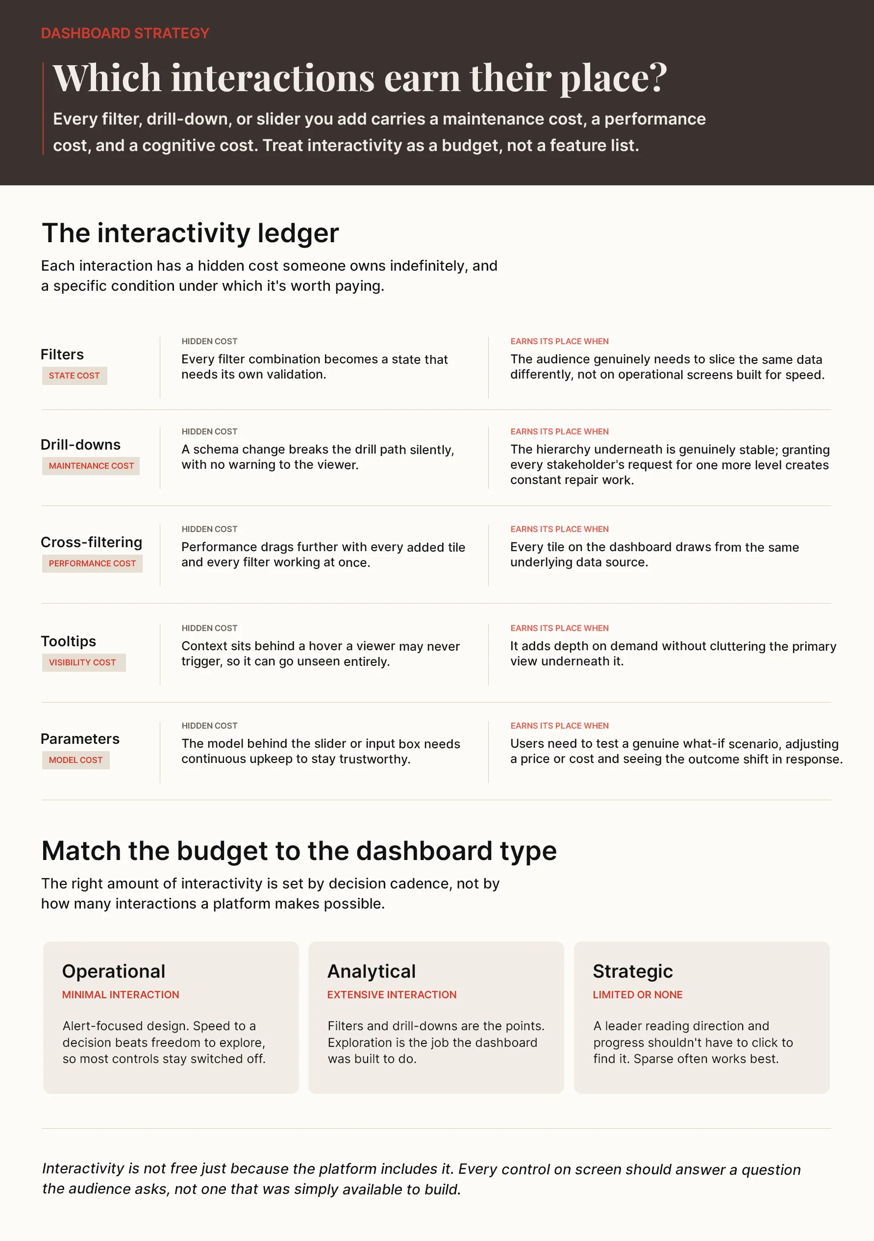
Every interactive element added to a dashboard carries a maintenance cost, a performance cost, and a cognitive cost for the user. It should deliver enough decision value to justify what it demands. Think of interactivity as a budget and spend it deliberately.
1. Filters
Filters let users refine data by dimensions like region, time period, or product category. They help focus analysis on relevant subsets. But their hidden cost is significant. Every filter combination becomes a state that needs validation.
Filters earn their place when the audience genuinely needs to slice data differently. They do not belong on operational dashboards where speed matters more than segmentation.
2. Drill-Downs
Drill-downs move users from aggregated views to granular breakdowns along meaningful hierarchies. They are useful when the hierarchy is stable.
Their problem is maintenance. Schema changes break drill paths without warning. Teams that grant every stakeholder request for deeper drill-downs produce surfaces that require constant repair.
3. Cross-Filtering
Cross-filtering lets users select data points in one visualization to filter all dashboard tiles at once. It works well in analytical dashboards where exploration is the purpose. Adding it to operational dashboards, where users need immediate answers, creates friction rather than clarity.
4. Tooltips and Details-on-Demand
Tooltips display contextual information on hover without cluttering the primary view. Evidence-based tooltips change based on user interactions and current values. They add depth beyond static text. Sheet tooltips support multiple visuals in free-form layouts.
5. Parameters and What-If Analysis
Parameters enable scenario modeling. Users adjust variables, such as prices, costs, or volumes, through sliders or input boxes and see the impact on outcomes immediately. The models underneath need continuous maintenance as business rules change.
6. Matching Interaction to Dashboard Type
Operational dashboards favor minimal interaction with alert-focused designs. By contrast, analytical dashboards support extensive exploration through filters and drill-downs. Strategic dashboards often work well with limited or no interaction.
Accessibility: The 2026 Baseline for Dashboard Design
Accessibility used to be treated as a finishing touch, added after launch if time permitted. That approach no longer holds. The European Accessibility Act became enforceable across EU member states on June 28, 2025, and Web Content Accessibility Guidelines (WCAG) 2.22, published by the World Wide Web Consortium (W3C), is the standard regulators and courts increasingly point to when assessing whether a dashboard is accessible.
This is general compliance information, not legal advice. Exact obligations depend on jurisdiction, sector, and organization size. Organizations within regulatory scope now treat dashboard accessibility as compliance work from day one.
WCAG 2.2 Level AA sets the baseline across four dimensions: perceivable, operable, understandable, and robust. Missing any one of them creates a gap that no amount of design refinement can paper over.
- Contrast: Text and annotations require a contrast ratio of at least 4.5:1 against their backgrounds; large text (18pt or 14pt bold and above) and graphics need a minimum 3:1 ratio. Dashboards below these thresholds fail the standard.
- Color Color cannot carry meaning alone: Around 8%3 of men and 0.5% of women have some form of color vision deficiency (CVD). Red and green, the colors most dashboards use to signal success and failure, appear brown to users with strong CVD. Redundant encoding through labels, patterns, or shapes ensures meaning survives regardless of how a user perceives color.
- Keyboard and Focus Navigation: All interactive elements must be reachable through keyboard, with visible focus indicators meeting the 3:1 contrast requirement, so users can navigate with Tab, Enter, and arrow keys without a mouse.
- Motion Control: Motion-activated functionality needs conventional alternatives and disable options, and animations running longer than five seconds need pause controls.
High-contrast designs work better in bright offices, direct labels reduce cognitive load for every user, and keyboard navigation removes friction for analysts running through dashboards at speed. Accessibility built in from the start costs far less than retrofitting it later, and dashboards built to WCAG 2.2 standards work better for everyone, not just those who require them.
Why Data Visualization in Healthcare Fails Without a Decision Architecture
The Dashboard Lifecycle: Adoption, Audit, and Archive
A dashboard that earns its place on day one can degrade over time. Each new stakeholder request adds a metric. Each added metric dilutes focus. This is accretion, and it is just as damaging as a poor initial design.
I. Adoption
A dashboard going live proves nothing on its own. Measure whether the intended audience actually uses it. Training people to read and trust the surface should be a part of the build, not an afterthought.
II. Audit
Audit with cadence rather than waiting for complaints. Ask, on a fixed schedule: Is the dashboard type still right? Is the decision still live? Are the metrics still certified? Do the charts still match their questions? Are the interactions still being used?
If the answers are unclear, the dashboard has already failed. It just has not been formally acknowledged yet.
III. Archive
Dashboards that have passed their usefulness do not need renovation; they need removal. Organizations that cannot retire old surfaces cannot prioritize the ones that matter. The used-weekly standard is the honest measure. The best dashboard is not the most sophisticated one. It is the one that serves a decision someone makes.
Damco’s Approach to Data Visualization and Dashboards
Damco’s data engineering practice builds dashboards across Power BI, Tableau, and every major BI platform without selling any of them. Our methodology stays the same no matter which rendering engine sits underneath: name the decision and its owner, derive the questions it needs answered, bind each question to a metric certified in a governed layer, choose a visualization that matches the question’s structure, and build the visual hierarchy from there.
The metric governance work happens before a single chart gets built, following the doctrine set out in Damco’s enterprise data visualization strategy guide. Dashboard estate audits run on the same five-question checklist covered in this guide’s lifecycle section, and dashboards that fail it move to the archive queue rather than a redesign backlog.
The choice of platform sits outside this methodology. The decision-first framework works on whatever platform your organization has in place.
Businesses that want dashboards built around decisions their teams make can consult Damco’s data visualization services experts. The platform is already there. The structure is what most dashboard programs are still missing.
Conclusion
A data visualization dashboard earns daily use only when it starts with a decision, not a dataset. Matching type to decision cadence, designing backward from that decision, spending the interactivity budget deliberately, and building to WCAG 2.2 from day one all follow from that single principle. If you are considering building dashboards on this methodology, schedule a call with Damco’s data visualization specialists today.
References
- 1. MediaPost
- 2. W3C WAI
- 3. Market.us Media
Frequently Asked Questions
A business intelligence dashboard curates multiple visualizations into a single decision surface for a defined audience and cadence, pulling from several data sources so users can monitor performance and act.
Dashboards split into three types by decision cadence. Operational dashboards support decisions made in minutes and shifts. Analytical dashboards support decisions made in days and weeks. Strategic dashboards support decisions made monthly and quarterly.
Design the dashboard backward from the decision: name the decision and its owner, derive the questions it needs answered, bind each question to a certified metric, choose a visualization that matches each question's structure, and build a visual hierarchy that puts the headline answer where the eye lands first.
A good interactive data visualization treats interactivity as a budget, not a feature list. A filter, drill-down, or cross-filter earns its place only if it serves the decision the dashboard exists for. Every interaction added beyond that becomes a maintenance cost someone owns indefinitely.
Yes. The European Accessibility Act, enforceable across EU member states since June 28, 2025, and the Web Content Accessibility Guidelines (WCAG) 2.2 set a regulatory baseline for organizations in scope, covering contrast, color-independent encoding, keyboard navigation, and motion control. Beyond compliance, these same requirements make dashboards easier to read for everyone.


